Choosing between a flex display and a grid display in CSS often comes down to very specific use cases. When we aim for a particular layout, we have to decide which one fits our needs best. This blog is going to delve into the differences and advantages of both Flexbox and Grid, guiding you on when to use one over the other, because understanding how each works is crucial to using them effectively in your designs.
The Basics of CSS Layout
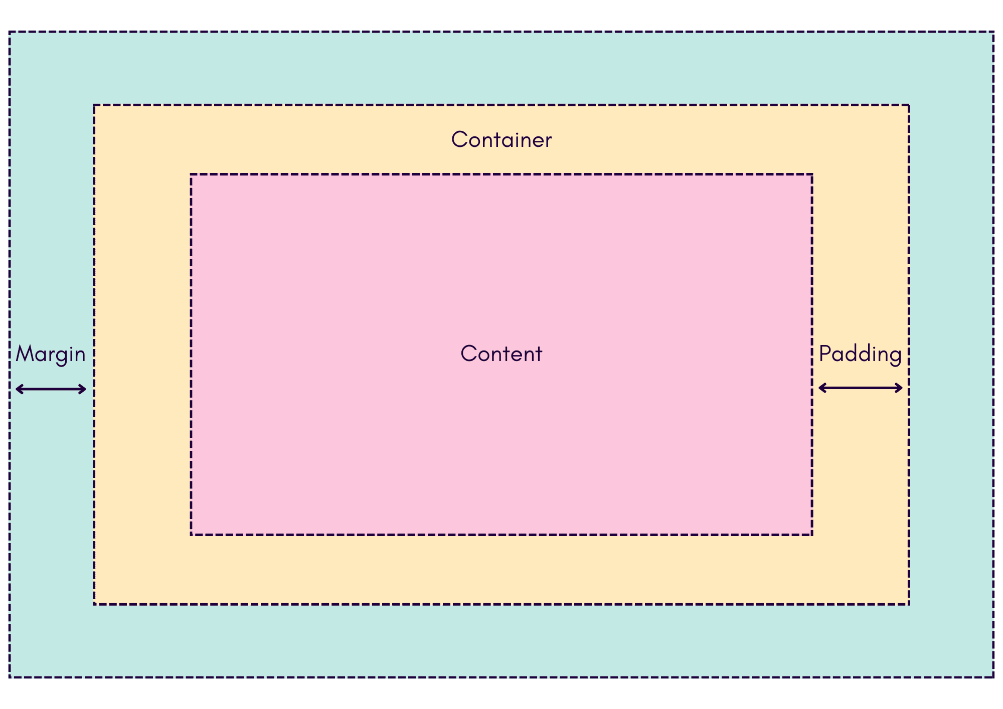
To grasp the complexities of Flexbox and Grid, we need to start with the default CSS layout, often referred to as the “box model.” In this model, the page is considered a large box, and elements are placed within it using padding, margins, or pre-defined values.
Elements in HTML typically have a default display property of either inline or block. Block elements stack vertically, pushing the next element onto a new line, whereas inline elements flow horizontally, placing the next element on the same line.
Flexbox: A One-Dimensional Layout Model
Understanding Flexbox
Flexbox, or the flexible box layout, is designed for one-dimensional layouts. It distributes and aligns items along a single axis – either horizontally (row) or vertically (column). By default, Flexbox arranges items in a row. However, this can be changed using the ‘flex-direction’ property in CSS, which has four possible values:
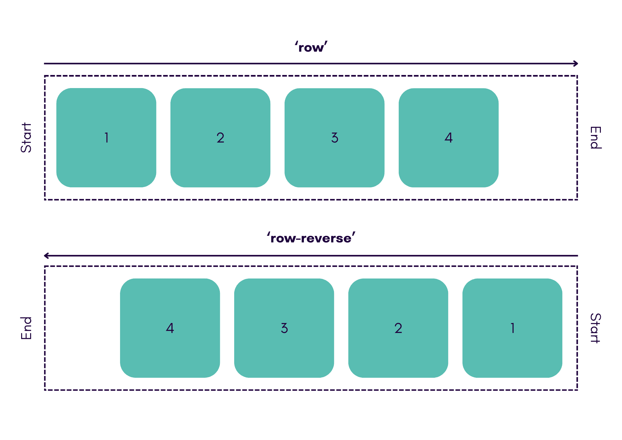
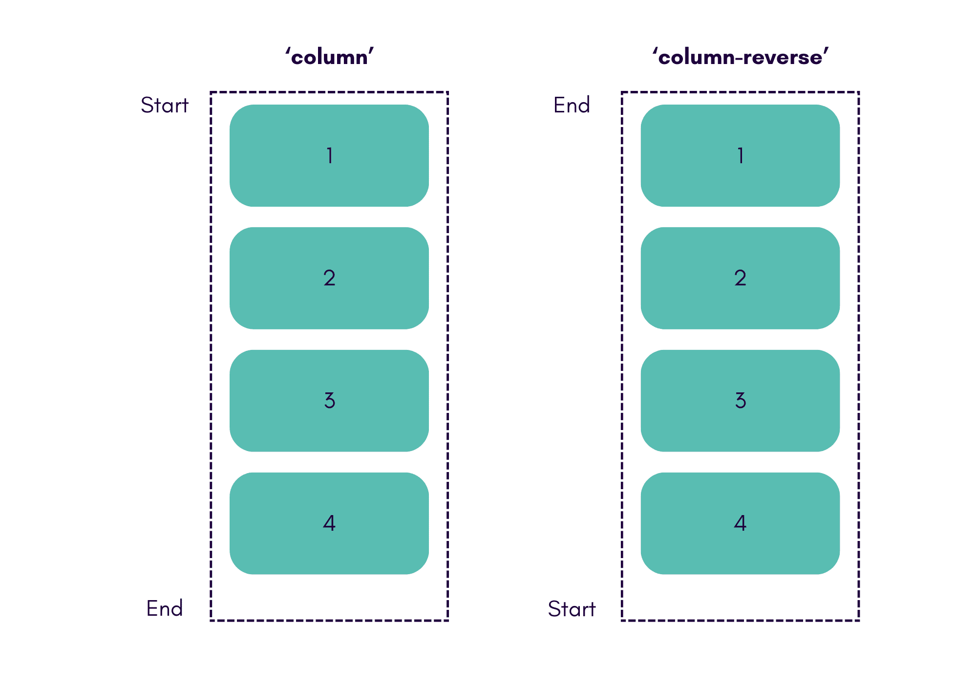
Here is an example:
.container {
    display:flex;
    flex-direction: row-reverse;
}
Flex-Wrap and Responsive Design
A significant feature of Flexbox is ‘flex-wrap’, which determines how items behave when the container becomes too small. By default, items in a flex container do not wrap, potentially causing overlap. Setting ‘flex-wrap: wrap’ allows items to move to the next line when necessary, creating responsive layouts.
We can edit this setting by using the CSS property called flex-wrap. By default, the setting is “no-wrap”, which means that regardless of how small the screen gets, the items within the box will remain on the same line – and this may cause overlap when resizing the screen. However, if we set the flex-wrap property to ‘wrap’, we will see that the items automatically move to the next line when the box gets too small.
Flex doesn’t look at the placement of items in other rows, and it tries to line things up with each other. Items that move to the next row are considered in their own flexbox.

For example:
.container {
    display:flex;
    flex-direction:row;
    flex-wrap:wrap;
}
Benefits of Flexbox
- Ideal for One-Dimensional Layouts: Flexbox excels at managing content along a single axis, making it perfect for simpler, linear arrangements.
- Alignment and Distribution: Properties like ‘justify-content’ and ‘align-items’ make it easy to align and distribute content within the container.
Grid: A Two-Dimensional Layout Model
Understanding Grid
Unlike Flexbox, CSS Grid is a two-dimensional layout system, allowing for both rows and columns. It divides the page into a grid of 12 columns and rows which can be changed by using multiples of two (in other words, 2, 4, 6, 8, 10, and 12). From here, the grid will auto-populate the columns depending on the items placed into them and the rows will be calculated accordingly.
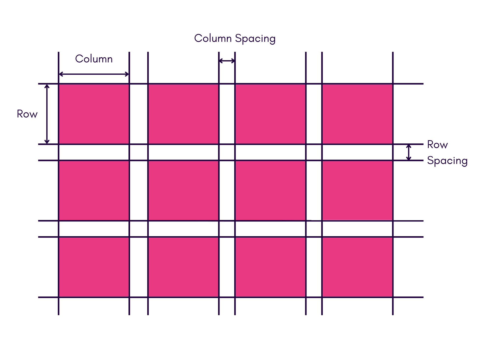
To create a grid, we would set the parent element to have a display of ‘grid’ using CSS. We can then specify how big and how many columns we want using the ‘grid-template-columns’ CSS property. Hereafter, we would specify the size using ‘px’ or ‘fr’, where ‘px’ will set the width as non-dynamic width (which will never change), and ‘fr’, on the other hand, will change depending on the size of the parent. The ‘fr’ stands for fraction and will divide the table or remaining space into the desired fraction – for example, if we wanted three rows of equal length regardless of the table size, we would do as follows:
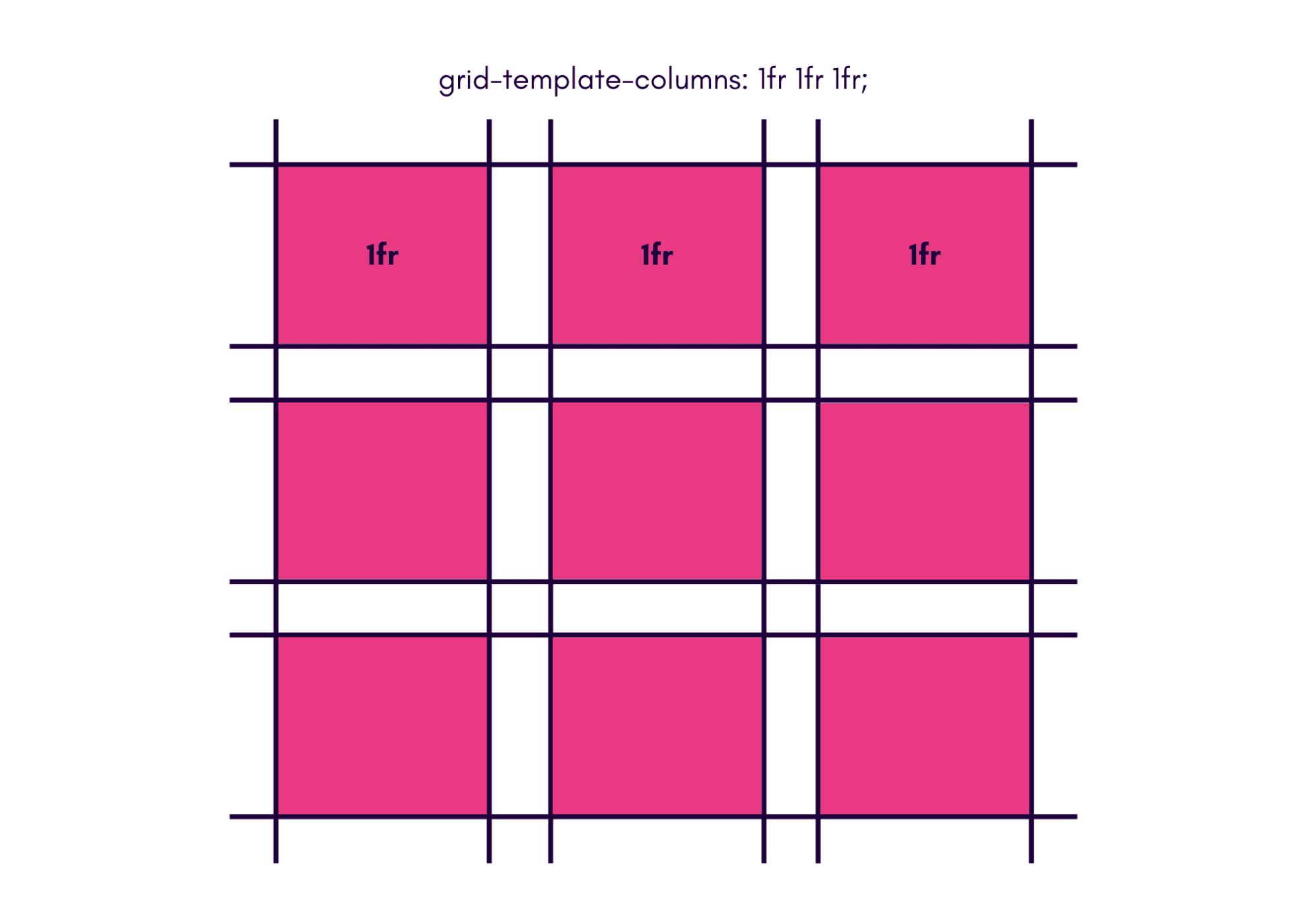
For example:
.container {
    display:grid;
    grid-template-columns: 1fr 1fr 1fr;
}
Mixing Units
You can mix fixed and flexible units for more complex layouts: if one of these parameters is a ‘fr’, it will divide up the remaining space of the grid. For instance, if I wanted my first column to be 300px and the rest to be divided into two, our grid would look like so:
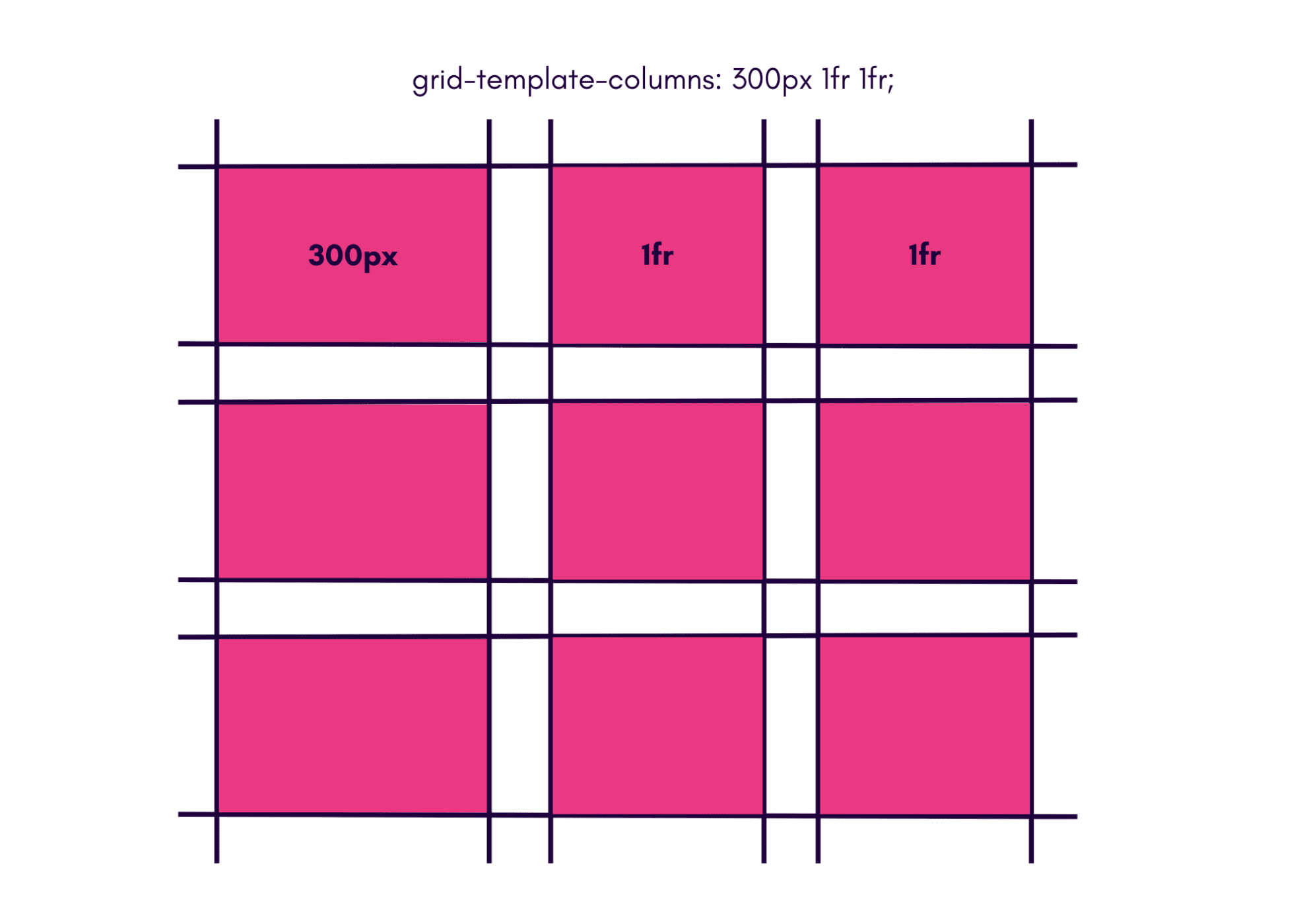
For example:
.container {
    display:grid;
    grid-template-columns:300px 1fr 1fr;
}
Benefits of Grid
- Responsive Design: Grid adapts easily to different screen sizes, making it perfect for complex, responsive layouts.
- Control Over Whitespace: Grid provides better control over the spacing and placement of elements, allowing for more precise designs.
- Consistent Structure: The grid pattern ensures consistent layouts, simplifying future edits and maintenance.
Flexbox and Grid are powerful tools in CSS, each suited to different layout challenges. Flexbox is excellent for simple, one-dimensional layouts, while Grid shines in more complex, two-dimensional layouts. Neither is inherently better: they are complementary tools that, when used properly, can create stunning and functional web designs. Always consider your layout and design needs before choosing which one to use, ensuring you leverage the strengths of both Flexbox and Grid to achieve your desired results.
Want to learn more about responsive and functional designs in Coding and Web/Software Development? Get in touch with our team of experts today!


