Model evaluation techniques are methods used to assess the performance of a predictive model. They help determine how well the model makes predictions on unseen data and guide the selection of the best model.
Evaluating predictive models is a crucial step in predictive analytics. Our Pillar Guide to Predictive Analytics provides a detailed look at model selection and software choices.
For a broader overview of building predictive models read our article here: Building Predictive Models
Holdout Validation
Holdout validation is often used in predicting whether customers will cancel their subscription to a service. For example, a streaming company has data on 1,000 customers. They split this data into two groups: one for training (800 customers) and one for testing (200 customers). The model is trained on the 800 customers, learning from patterns like how often they use the service, their subscription type, etc. Then, the model is tested on the 200 customers it hasn’t seen yet. This helps the company see how well the model can predict cancellations for new customers, ensuring it performs well on future data.
In Holdout Validation, a dataset is split into two parts:
• Part 1: The Training Set
• Part 2: The Test Set
Subsequently, the model is trained on the training set and evaluated on the test set. It is used for: Both classification and regression tasks
Cross-Validation
Cross-validation is often used when a company wants to ensure their model is reliable and performs well on new data. For example, a financial institution wants to predict whether loan applicants will default. They have a dataset of 1,000 applicants, so they split the data into 5 equal parts (folds). The model is trained on 4 folds and tested on the remaining fold. This process is repeated 5 times, each time using a different fold for testing. By doing this, the institution ensures that the model performs consistently across different subsets of the data, making it more robust for future predictions.
In Cross-Validation, a dataset is divided into multiple parts (folds).
The model is trained on some folds and tested on the remaining fold.
This process is repeated multiple times with different folds used for testing.
Here are some common methods used in Cross-Validation:
• k-Fold Cross-Validation: The data is divided into equal parts.
• Leave-One-Out Cross-Validation (LOOCV): Each data point is used as a test set while the rest are used for training.
It is used for: Both classification and regression tasks.
Confusion Matrix
A confusion matrix is used to evaluate how well a classification model is performing. For example, the NHS develops a model to predict whether a patient has a certain disease. After testing the model on patient data, they create a confusion matrix, which shows how many patients were correctly predicted to have the disease (true positives), how many were correctly predicted to not have it (true negatives), and where the model made mistakes, such as predicting a patient has the disease when they don’t (false positives) or missing a diagnosis (false negatives). This helps the NHS understand exactly where the model is succeeding or failing.
This technique is designed for “the confused” user, who needs some help to make decisions.
The process involves, compiling a table showing the counts of true positives, true negatives, false positives, and false negatives. It provides a detailed breakdown of classification results.
It is used for: Classification tasks
Accuracy
The accuracy technique is used to measure how well a classification model is performing by looking at the overall correctness of predictions. For example, a company builds a model to predict whether emails are spam or not. After testing the model, they calculate accuracy by dividing the number of correctly predicted emails (both spam and non-spam) by the total number of emails in the dataset. If the model correctly identifies 90 out of 100 emails, its accuracy would be 90%. This simple metric helps the company quickly understand how well the model is performing overall.
The accuracy technique is based on a ratio of correctly predicted observations to the total observations. It is constructed using the following formula:
It is used for: Classification tasks

Precision and Recall
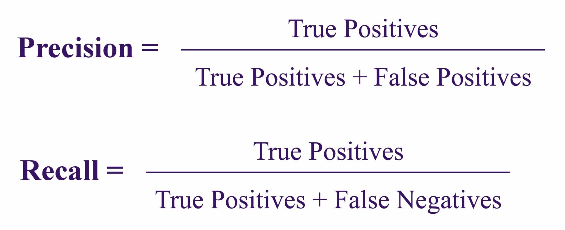
Precision and Recall are two metrics used to evaluate how well a classification model handles positive predictions.
- Precision: For example, in a model predicting if an email is spam, precision measures how many of the emails predicted as spam are actually spam. If the model predicts 50 emails as spam but only 40 are correct, the precision would be 80%. This helps ensure the model isn’t labeling too many non-spam emails as spam.
- Recall: Recall, on the other hand, measures how many actual spam emails the model successfully identified. If there are 100 spam emails in total, and the model correctly identifies 80 of them, the recall would be 80%. This focuses on how well the model finds all positive instances.
Together, these metrics help balance accuracy, especially when missing positive cases or false alarms can have different consequences.
For the Precision technique, the ratio of correctly predicted positive observations is applied to the total predicted positives.
In the case of the Recall technique (Sensitivity or True Positive Rate), the ratio of correctly predicted positive observations is applied to all the observations in the actual class.
It is used for: Classification tasks
Both the Precision, and the Recall techniques are constructed using the following formulas:

F1 Score
The F1 Score is a metric that balances both Precision and Recall by using their harmonic mean. For example, in a model predicting whether a loan application is fraudulent, the F1 Score helps measure the model’s ability to catch fraud (recall) while also ensuring it doesn’t incorrectly label too many legitimate applications as fraud (precision). This is especially useful when dealing with imbalanced datasets, where one class is much larger than the other, as it provides a single, balanced score that captures the model’s performance in handling both correct and incorrect positive predictions.
This technique uses the harmonic mean of Precision and Recall. It provides a single metric that balances both concerns, particularly useful in cases of imbalanced datasets.
The F1 Score technique is predicated on the following formula:
It is used for: Classification tasks

ROC Curve and AUC (Area Under the Curve)
The ROC Curve
The ROC Curve is a graph used to evaluate how well a classification model distinguishes between positive and negative classes at different thresholds. For example, in a medical test predicting whether a patient has a disease, the ROC Curve shows the trade-off between catching true cases (True Positive Rate) and the number of false alarms (False Positive Rate).
This technique takes the form of a graph showing the performance of a classification model at different classification thresholds. It plots the True Positive Rate (Recall) against the False Positive Rate (1 – Specificity).
The AUC technique
The AUC (Area Under the Curve) summarizes the ROC curve into a single value. A higher AUC indicates a better-performing model, as it means the model is better at distinguishing between patients with and without the disease. This is particularly helpful when comparing multiple models to see which one performs best overall in terms of classification accuracy.
The AUC technique calculates the area under the ROC curve, summarising the overall ability of the model to discriminate between positive and negative classes.
It is used for: Classification tasks
Logarithmic Loss (Log Loss)
Logarithmic Loss (Log Loss) is used to evaluate how well a classification model performs when predicting probabilities. For example, in a model predicting whether a customer will make a purchase, Log Loss measures how far the predicted probability (e.g., 0.7 likelihood of buying) is from the actual outcome (either buying or not buying). A lower Log Loss means the model’s predictions are closer to the true values, indicating better accuracy. This metric is particularly useful for models that output probabilities rather than just yes/no predictions, as it captures both the correctness and the confidence of the model.
Logarithmic Loss (Log Loss) measures the performance of a classification model where the prediction output is a probability value. Lower Log Loss indicates better accuracy.
It is used for: Classification tasks
Mean Absolute Error (MAE)
Mean Absolute Error (MAE) is a metric used to evaluate the accuracy of a regression model by measuring the average difference between the predicted values and the actual values. For example, in a model predicting house prices, MAE would calculate how far off the predicted prices are from the actual prices. If the MAE is low, it means the model is making predictions that are close to the true values. This metric is easy to interpret because it provides the average error in the same units as the predicted variable, making it useful for understanding how well the model performs in practical terms.
The Mean Absolute Error (MAE) is the average of the absolute differences between predicted and actual values.
It is used for: Regression tasks
This technique is formulated as follows:

Mean Squared Error (MSE) and Root Mean Squared Error (RMSE)
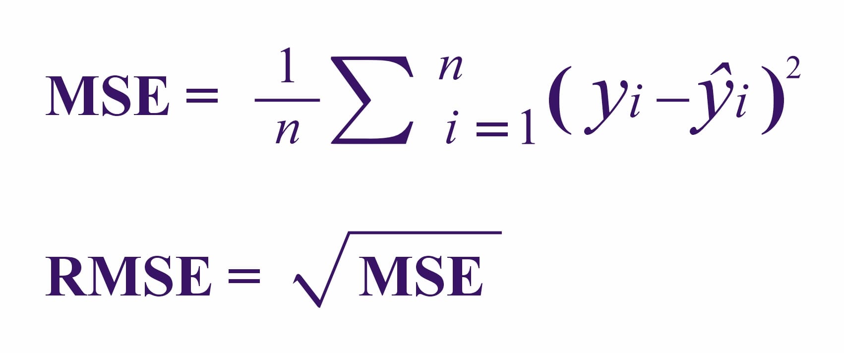
Mean Squared Error (MSE) and Root Mean Squared Error (RMSE) are both used to measure the accuracy of regression models.
- MSE calculates the average of the squared differences between the predicted values and the actual values. For example, in a model predicting house prices, MSE shows how far off the predictions are, with larger errors being penalized more because they are squared.
- RMSE is simply the square root of MSE, bringing the error back to the same units as the original data (like dollars for house prices). RMSE is more interpretable since it reflects the actual scale of the errors, making it easier to understand how well the model is performing in real-world terms. Both metrics help assess the model’s accuracy, with RMSE providing more intuitive insights.
It is used for: Regression tasks
Their formulaic construction is as follows:

R-squared (R²) and Adjusted R-squared
R-squared (R²) and Adjusted R-squared are metrics used to evaluate how well a regression model explains the variation in the data.
- R-squared (R²) indicates the proportion of variance in the dependent variable that the independent variables explain. For example, in a model predicting house prices, an R² of 0.85 means that 85% of the variation in house prices can be explained by the model’s features (e.g., location, size).
- Adjusted R-squared is a more accurate version of R² when multiple predictors are used. It adjusts for the number of predictors in the model, preventing overestimation of how well the model fits the data. This is especially useful when comparing models with different numbers of predictors, as it accounts for any added complexity.
It is used for: Regression tasks
Bias-Variance Trade-off
The Bias-Variance Trade-off is a concept used to balance a model’s complexity to achieve better performance.
- Bias refers to errors that occur when the model is too simple and can’t capture the underlying patterns in the data, leading to underfitting. For example, a very basic model might miss important trends in predicting house prices.
- Variance refers to errors that happen when the model is too complex and captures too much noise from the training data, leading to overfitting. For example, a model that is too detailed might perform well on training data but poorly on new, unseen data.
The goal of the bias-variance trade-off is to find the right balance between the two, ensuring the model is neither too simple nor too complex, so it generalizes well to new data.
Bias-Variance Trade-off is a technique used to balance the complexity of the model to avoid overfitting (high variance) and underfitting (high bias).
It is used for: Both classification and regression tasks
Residual Analysis
Residual Analysis is a technique used to evaluate how well a regression model fits the data by analyzing the residuals, which are the differences between the predicted values and the actual values.
For example, in a model predicting house prices, the residuals represent the difference between the predicted price and the actual price. By examining these residuals, the analyst can check for patterns or trends. Ideally, residuals should be randomly scattered, which indicates that the model fits well. If patterns or clusters appear, it may suggest issues like incorrect model assumptions or missing variables, prompting further model adjustments.
Residual Analysis is used for examining the residuals (the difference between predicted and actual values) to check for patterns that indicate potential issues in the model.
It is used for: Regression tasks
Lift and Gain Charts
Lift and Gain Charts are used to assess how well a classification model is performing compared to random guessing.
- Lift Charts show how much better the model is at predicting positive outcomes compared to if you were just guessing. For example, in a model predicting which customers are likely to buy a product, a lift chart demonstrates how much more effective the model is at identifying buyers versus random selection.
- Gain Charts show the percentage of positive outcomes captured by the model as you move through the dataset, typically used to measure how effectively the model identifies top prospects (like likely buyers) early on.
These charts help visualise the model’s effectiveness and are useful for making decisions about which prospects to target in marketing or similar classification tasks.
Lift and Gain Charts are tools to evaluate the effectiveness of a classification model by comparing the model’s ability to predict a positive outcome against random guessing.
It is used for: Classification tasks
Cumulative Accuracy Profile (CAP) Curve
The Cumulative Accuracy Profile (CAP) Curve is a graphical tool used to assess the performance of a classification model.
For example, in a model predicting loan defaults, the CAP curve plots the cumulative number of true positives (correctly predicted defaults) against the cumulative number of all actual positives (total defaults). The curve helps visualize how well the model identifies true positives compared to a random model. A steeper curve indicates a better-performing model, as it captures more true positives early on. CAP curves are especially helpful for comparing multiple models and selecting the one that performs best in identifying the desired outcomes.
Cumulative Accuracy Profile (CAP) Curve is graphical tool to evaluate model performance by plotting the cumulative number of true positives versus the cumulative number of all positives.
It is used for: Classification tasks
Final thoughts
These evaluation techniques help in understanding how well a model is likely to perform on new, unseen data and are essential in selecting the best model for a given task. Model evaluation is not a one-size-fits-all process. Different models and different tasks require different evaluation techniques. By mastering these top model evaluation techniques, you can ensure that your predictive models are both accurate and reliable, paving the way for data-driven decisions that you can trust.
Once you have evaluated your models, you can explore various predictive analytics tools that streamline this process in our Predictive Analytics Software guide
Whether you’re a seasoned data analyst or just getting started, understanding these evaluation techniques is crucial for building models that perform well in the real world. So, the next time you build a model, make sure to evaluate it thoroughly – because a model is only as good as its evaluation.


